COLOR:
The color green relates to the Wicked Witch, obviously because of her skin color but also because her character has a green smoke/ fog around her when she appears or vanishes from a scene. This makes me think of Disney and how most of their evil characters have some sort of green smoke or fog that relates to them or shows their presence. The green makes you think putrid, evil, and toxic. So the green is to signify evil but we can also say that it is to signify the envy that the Wicked Witch has towards Dorothy. Not only for her shoes but also for her beauty and youth.
LIGHT:
The witch is cast in a shadow. She wears a wide brimmed hat that shadows her face even when she is in the day. Even though she is mostly in her dark, damp, castle. She is wearing a black cloak, which further accentuates the darkness, and shadow she is cast in. The Wicked Witch is the darkness in sharp comparison to the light that is the Good Witch Glinda of the North. This dichotomy is what makes it apparent that she is evil in the story. Whenever the witch appears in the movie she is accompanied by darkness. Either the sky becomes grey or it seems that a storm is close by. The black cloak and darkness also distract us from other features of the witch and make us focus only on her face. This is important because it is the easiest way to convey an evil mood.
SHAPE:
A repeated shape is used in the Wicked Witch character. She has a pointed triangle shaped hat, her nose is pointed and triangular, she rides a broom, which is triangular in shape. Her nails are also pointed and look sharp. These repeated points and sharp edges that are used around the witch give an evil feeling, just like the color green and the shadow that she is cast in. I think that the triangle is used repeatedly because sharp edges give a sense of danger, almost animalistic. Curved edges are more kind and human like. This even further gives the Wicked Witch of the West an evil demeanor.
COLOR:
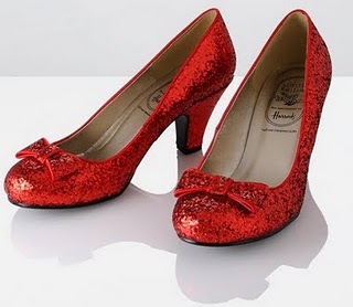
In comparison to the Wicked Witch, Dorothy is wearing white with blue-checkered overalls. This is analogous to the witches green hue. With the red slippers that are one of the main elements the film they all three create a split complimentary color scheme. This strengthens the use of color in the whole film by having these three main factors in the movie connected. The light blue and the white she is wearing make for a more interesting character to look at. We are not only focused on her face like the witch, but we see her as a whole unit, including the ruby slippers. We can say that the reason that a checkered plaid pattern is used because it gives us a sense of comfort, a tablecloth at a picnic for instance, the blue pattern is familiar.
LIGHT:
The light that is surrounding Dorothy always seems to be more luminescent than what is around her. She has a kind of glow about her. Even when they are in the dark forest she seems to have a sort of diffused spotlight on her. This light she emits seems to carry to the characters around her, symbolizing that her goodness is being spread out to the others. Not anything direct or focused just a general lightness. I think that this is symbolic because she is a young fair woman and fighting against the dark evil witch so anywhere that you can contrast that it strengthens that relationship. So by having her have a paler complexion and a light about her, it helps depict her as the protagonist and the general do-gooder character. I choose the picture of the glass bottles because they seemed to have a glow about them, that is diffused.
SHAPE:


No comments:
Post a Comment